 Open wechat to scan
Link is copied

Residential Space Design Global TOP 5
Winner:朴悦设计
WINNERS:惠州·华润小径湾
在这个繁忙且高流动性的社会中,第一住所不仅要满足家庭成员的各种生活需求,还承载了许多额外的期望。因此,越来越多的人选择在城市远郊寻找第二住所,以寻求一个暂时的避风港,一个可以放下所有伪装和束缚的地方,让真实的自己得以栖息。 本案正是这样一处第二居所——一栋位于海边的别墅,第二居所的绝妙之处在于对空间“浪费”的艺术,不同于第一居所中精打细算,恰到好处的浪费而营造的空旷,将人们瞬间从日常的琐碎中抽离,进入度假的心境之中。 日光与景观被充分的引入室内,从入户的一刻起,家,就开始与自然交融。不论身处哪一个角度,每个场景下的家,都随着海的呼吸而起伏。 因此,在室内材质的选择上,朴悦设计也选择了与自然更为贴近的材料。天然石材茶几与边几,中古感的木质餐桌和边椅,组合呈现出自然又质朴的轻松氛围,由老木头打磨出的矮凳、竹编单椅、麻布质感的沙发......灵动的场景在光影自然中交糅,渲染出安静的场域。

Residential Space Design Global TOP 5
Winner:i29
WINNERS:Canal House Amsterdam
Amsterdam based studio i29 converted a neglected 17th century canal house into a bright home with unexpected views and room for discovery. The house is located along the canals near Amstelveld, originally constructed in 1675. Over the years the house had been fallen into almost a complete ruin, the renovation took more than 2 years and was executed in collaboration with a team of specialists. The new interior highlights different areas in color which gives a new perspective on the monument. Original details are variously exposed or hidden in colorful rooms. To create unexpected sight-lines and a spatial experience, the different spaces are connected by allowing color or finish to continue from one space to another. In contrast to the existing structure, new interventions and finishes by i29 are clearly recognizable. The kitchen space on the ground floor is finished in white concrete, light walls and a custom designed oak kitchen and dining table. As you walk through, a green glass volume marks a hidden guest room that is fully equipped with an en-suite bathroom and access to the garden. The kitchen is visually connected to the study room above through a gray stained oak wall, which also forms a beautiful entrance to the rooms above. The same gray continues in the living room but in a fabric wall covering for acoustics. Behind the rotating book wall in the living room is another hidden area completely in a calming blue finish to read or relax. Upstairs you enter the sleeping quarters, where the design radiates comfort and luxury like a true hotel experience. The master bedroom with its original roof construction is separated from the bathroom by a mirrored volume that encloses both the stairwell and shower area. The shower walls are constructed with two-way mirrors, which gives a direct view of the canals. The adjacent bathroom has a traditional Japanese bath and freestanding matching sink in wood. All new and clearly designed interventions are tailor-made for this 17th century house, so it fits completely within the existing environment, but also raises the house to a higher level and is ready for the next generation. Credits Client Private Interior design i29 Object Canal House Amsterdam Size 115 m2 Restoration Kodde Contractor G.K. Visbeen & Co. Interior builder Schneider Interieurbouw Photo’s Ewout Huibers

Residential Space Design Global TOP 5
Winner:深圳市万相无形设计有限公司
WINNERS:九洲 · 蓝海公寓
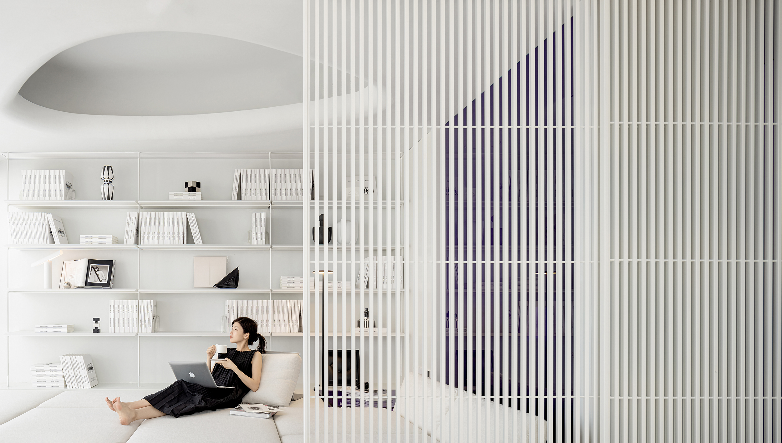
万相无形受九洲控股的邀约,为城市新生代圈层打造兼具时尚风格及艺术质感的公寓产品。万相无形认为新生代都市人群更注重居住空间的个性化设计,氛围感以及功能的多样性;对于年轻人来说,家不仅是休息的地方,更要满足工作、社交、爱好、娱乐以及生活等多样的需求。功能规划上改变了传统单一划分格局的方式,而是以居住者的需求作为主导,让空间的功能可以随着需求的转变而变换,创造丰富多元的复合空间和活动场景,从而让居住空间拥有更多的自由与可能性。生活有无限可能,居住空间也有无限可能。跳脱关于“家”的常规定义与束缚,不同生活场景之间互相转换和渗透,设计让边界消隐,而现代空间居所的无限可能也将不被定义,美好生活的边界亦是自由无限的。 FREEFORM DESIGN is invited by Jiuzhou Holdings to create apartment products that combine fashion style and artistic texture for the new generation of urban circles. FREEFORM DESIGN believes that the new generation of urban population places more emphasis on personalized design of residential spaces, a sense of atmosphere, and diversity of functions; For young people, home is not only a place to rest, but also a place to meet diverse needs such as work, socializing, hobbies, entertainment, and life. Interior design has changed the traditional single division pattern in functional planning, but is dominated by the needs of the residents, allowing the functions of the space to change with the changes in needs, creating rich and diverse composite spaces and activity scenes, thereby giving residential spaces more freedom and possibilities. Life has infinite possibilities, and living space also has infinite possibilities. Jumping away from the conventional definition and constraints of "home", different life scenes transform and permeate each other, and the design allows boundaries to disappear. The infinite possibilities of modern spatial living will also be undefined, and the boundaries of a beautiful life will also be free and infinite.

Residential Space Design Global TOP 5
Winner:NOTHING DESIGN
WINNERS:极简风顶层复式
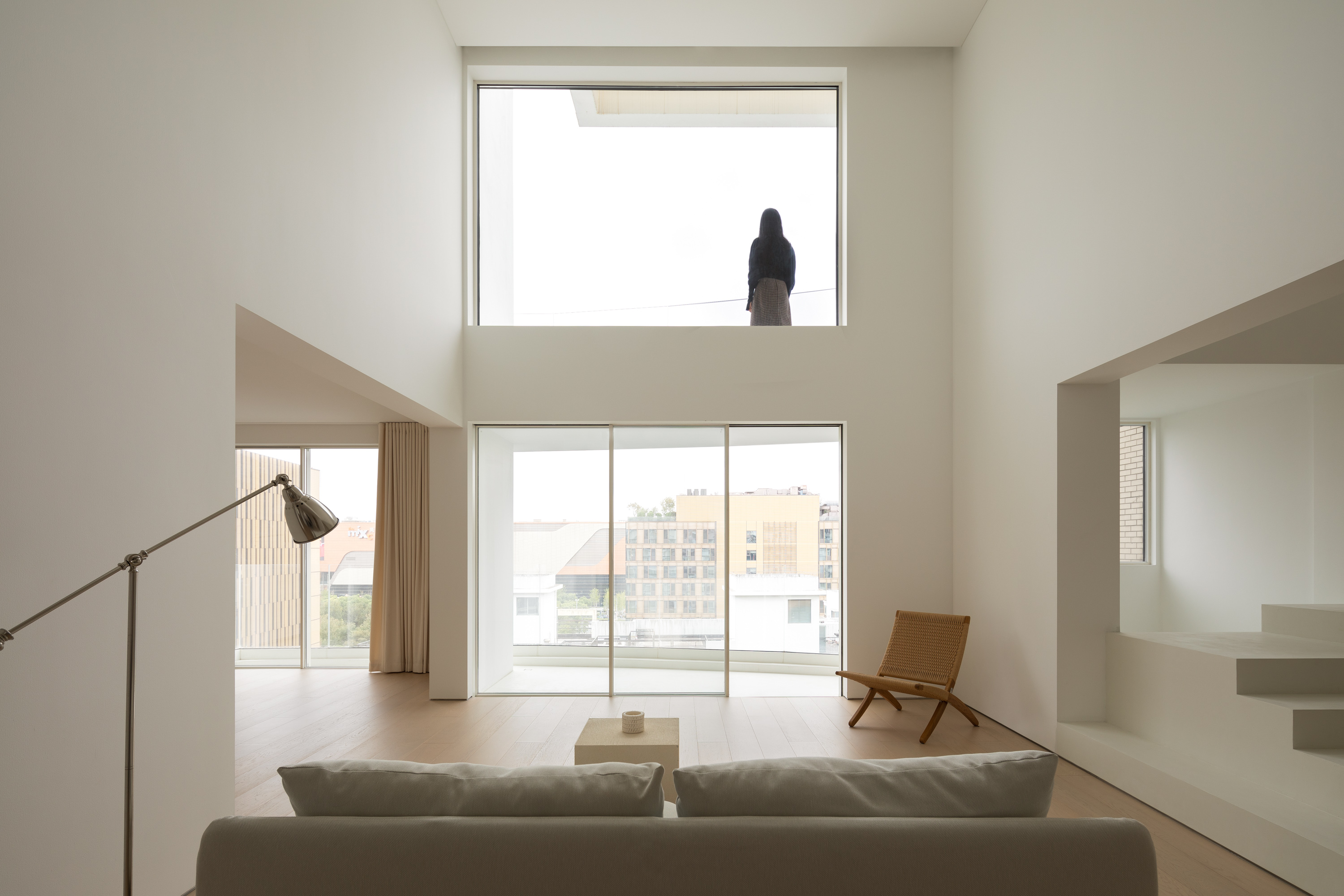
极简风顶层复式/NOTHING DESIGN工作室 开放的空间动线,探索家的趣味性 方案规划并未严格界定公共空间的功能框架,而是根据使用者的生活习惯和空间特征,为室内创造更多不受限制的可能性。 整体以极简开放作为核心理念,凭借对可塑性和功能的思考将室内设计推向建筑塑造领域。 特别定制的入户门将玄关和室内归于统一,对于整体开放流动的场域来说,这个细节有效规避了突兀的视觉感受。玄关部分采用木盒子的构筑手法,营造材质与结构的视觉张力。 一层公共空间,整体以暖色的原木材质靠近地面及需要接触的立面,冷色和垂直线条靠近上方及存在视觉重心的位置,保证温润触感的同时,塑造硬朗极简的空间气质。通过将墙体裸露,剥离出设计既定的场域框架,使得建筑基底以几何坐标的姿态呈现。不同功能的模块间保持开放流动,属性各异的单元被置于开敞的区域里彼此独立又彼此关联。 设计有意打破传统空间追求闭合连通的思维定式,将墙体以绝对的裸露及雕塑化呈现,在连续与断裂的进退之间,形成独特的几何学美感。 设计打破模块之间的边界,裸露出开放的内部结构。 同时以墙体的矩阵式序列变化,揭示不同轴线所代表的功能属性。环梁满足了空调和通风设备所需的储存空间。视觉体积感在白色的暗示下,变得具象而更有感知意义上的张力。 临窗位置旨在呈现一种动态的无中心化模组体系,没有既定的空间动线与路径指引,没有模式化的形式与功能,最大程度拉伸视距广角。墙体结构及梯步以隐匿的存在感,作为空间的一部分和家具构筑室内和谐的比例和建筑尺度。 给予餐厨模块间更大的尺度关系,增进身处其中开敞的交互式体验。利用餐厨空间的墙体进行路径分割,衍生出新的洄游动线,激活围绕建筑行走的趣味。地面系统与家具选择原木材质,与纯白面板及墙壁形成对比,整体利用功能化的有机设计完成餐厨属性的开发。柜体和墙体的边界感被纯白色块消除, 双采光面的餐厨模块中,不同视角给人带来不同的视觉转换。墙面与柜体和周围功能分区在立面系统上建立平齐关系,为厨房操作提供更为灵活的形式。 从楼梯开始,空间进行了全新的再分布。提前预埋悬臂式型材入墙,强化台阶穿插间的建筑美感,使楼梯成为贯穿一二楼的重要纵向装置。外包原木肌理的极简梯步给人带来温润的视觉感受,钢化玻璃扶手不会增加任何视觉负担,整体悬浮感营造得恰到好处。 无边框把手的隐形门和背景墙融为一体,营造连贯延续的视觉效果。走廊以点、线、面的变化形式展示建筑的极简内核。 卫生间顶部的窗洞开口创造出可以洒进阳光的缝隙,自然光的介入使得光线成为空间的关键元素。 作为空间动静转换的临界,设计利用“建筑式思维”呈现走廊立面,极简的细节处理营造场景中深邃的进深变化。 主卧剔除掉多余的主观内容,以延伸极简感官的界限,通过对比例、材料的细节处理实现对空间的表达。右侧的平开式推拉门将室内空间与外部区域的弧形露台相连接,克制冗杂的元素堆砌,简单的平立面线条将建筑的雕塑感凸显。 客卧部分只保留最基础的功能,整体围绕中空隔墙为轴线放入现有布局中,不同功能依次展开,以定义一个新的休憩空间。天窗引入自然光线,使空间更加立体。透光量由哑白百叶实现精细化控制。光线的进入需要得到控制,视线的发散同样需要保持克制,压缩视线范围后的中空隔墙反而可以聚焦更为丰富的场景体验。 在确保实用性为首要因素的基础上,赋予材质最基础的形状,壁挂马桶、墙出水龙头及壁龛柜的模块组合,探索卫浴空间的极简视觉和形式价值。 项目信息 设计团队:NOTHING DESIGN工作室 公司网站:www.nothingdesign.cn 项目位置:中国上海 项目面积:250㎡ 完工时间:2022 材料:木地板、微水泥、乳胶漆 摄影:WM Studio Minimalist Penthouse/ NOTHING DESIGN Open space with dynamic lines, discover the fun of home The layout plan offers more open alternatives for the interior space according to the spatial preferences and lifestyles of the users, rather than precisely defining the functional framework of the public space. The main idea is minimalist openness, and by focusing on plasticity and function, the interior design is catapulted into the realm of architectural sculpture. A custom-made entrance door connects the entrance area with the interior. This detail ensures that the space is open overall, avoiding an abrupt appearance. The entrance area uses a wooden box construction to create a visual tension of material and structure. The ground floor is a public space with warm woods near the floor and on the elevations that need to be touched. The cold tones and vertical lines are positioned close to the top and the visual center, ensuring a warm touch while creating a hard, minimalist space. By exposing the walls, the framework of the designed field is stripped away, allowing the architectural substrate to be presented as a geometric coordinate. The different functional modules are kept open and flowing, with units of different attributes placed in open areas that are both independent and interconnected. The design intentionally breaks with the traditional mindset of closed and connected spaces. The walls are presented in an absolutely bare and sculptural way. A unique geometric aesthetic is created between the continuous and fractured progressions and retreats. The design breaks down the boundaries between the modules to expose the open internal structure. At the same time a matrix sequence of variations in the walls reveals the functional properties represented by the different axes. The ring beam accommodates the storage space required for the air conditioning and ventilation equipment. The visual sense of volume is suggested by the white, becomes figurative and more tense in a perceptual sense. The window positions are intended to present a dynamic, centreless modular system, without established spatial lines and pathways, without patterned forms and functions, maximising the view angle. The wall structure and the staircase have an invisible presence, as part of the space and as furniture to create a harmonious proportion and architectural scale in the interior. The relationship between the dining area and the kitchen modules has been enlarged to enhance the open and interactive experience in these areas. The walls of the dining room are divided into pathways to create new walking routes that stimulate interest in walking through the building. Flooring system and furniture are made of original wood and contrast with the plain white panels and walls. The overall functional and organic design is used to develop the attributes of the kitchen and dining room. The boundary between the cabinets and the walls is eliminated by the pure white blocks, and the dual light surface of the dining module provides different visual transitions from one perspective to another. Walls are flush with the cabinets and surrounding functional zones in the facade system, providing a more flexible form for kitchen operations. Starting with the staircase, the space has been redistributed in a new way. The cantilevered profiles are pre-built into the wall to reinforce the architectural aesthetics of the interspersed steps, making the staircase an important vertical device that runs through the first and first floors. The minimalist staircase, clad in raw wood, gives a warm visual impression and the toughened glass handrail does not add any visual burden, creating the right sense of suspension. The invisible doors without handles are integrated into the back wall, creating a continuous visual effect. The corridors show the minimalist core of the building in the form of changing points, lines and surfaces. A skylight was cut into the ceiling of the bathroom to allow sunlight to enter the interior. By using natural light, the light becomes a key element of the room. As a proscenium for the transition between dynamic and static spaces, the design uses 'architectural thinking' to present the corridor facade. The minimalist detailing creates a change of depth in the scene. The master bedroom has been stripped of everything superfluous to push the boundaries of minimalist sensibility. The expression of the space is achieved through the detailing of proportions and materials. The flush sliding door on the right connects the interior with the curved terrace of the exterior, the restraint of complex elements, simple flat lines of the facade bring out the sculptural nature of the building. In the guest room area, only the most basic functions were retained and the whole is placed in the existing layout on the axis of the hollow partition wall, with the various functions unfolding one after the other to define a new resting space. The skylight brings in natural light and adds a new dimension to the space. The light transmission is finely controlled by matt white blinds. The incidence of light must be controlled and the dispersion of views must be kept in check. The compressed view of the partition allows for a richer scene experience. Ensuring that practicality is the primary factor, giving the material its most basic shape, the modular combination of wall-mounted toilets, wall outlet taps and niche cabinets, exploring the visual and formal value of the minimalist bathroom space. Project Info Design Team:NOTHING DESIGN Website:www.nothingdesign.cn Location:中国上海 Area:250㎡ Completion Time:2022 Materials:Wooden Floor、Micro-cement、Paint Photography:WM Studio


